
Thursday, October 31, 2013
Tuesday, October 29, 2013

Thursday, October 24, 2013
Addison Gallery of American Art: "The Kids are Alright"
1. Compare and contrast: Betsy Schneider and Jocelyn Lee


2. Choose one or two artists whose work you connected with the most. Describe why the piece spoke to you. Did you have an emotional response?


3. On a more critical note, choose a piece that may have given you a negative emotional response or perhaps a piece that should not have been in the exhibition. Be descriptive in explaining the piece and why you had this response.

4. Do you take photographs of your family? Why or why not? When you were young, who took the photographs in you family? Do you have a favorite family photograph? If so, please describe it.
5. What three observations can you make about the entire exhibit, other than the obvious facts that it was about family and photography.
6. Has this exhibition changed the way you think about making photographs? Why or why not?
7. Define the following:
Pigment print:
printing by the use of pigments instead of dyes. The pigments do not penetrate the fiber but are affixed to the surface of the fabric by means of synthetic resins which are cured after application to make them insoluble. The pigments are insoluble, and application is in the form of water-in-oil or oil-in-water emulsions of pigment pastes and resins.
Cibachrome print:
also called "silver-dye bleach prints." The dye destruction process depends upon the bleaching of dyes that are formed wholly in the sensitized material, rather than formed during processing
Chromogenic print:
a print made when colored dyes are put on the emulsion in multiple layers and are sensitized to different wavelengths of light
Giclee/Iris print:
high quality digital inkjet prints produced on art paper
Lightjet print:
an actual photographic print exposed by the Lightjet laser printer. The printer reads the information in a digital file, then uses lasers to expose the image onto Archive paper. Lightjet prints are made on light-sensitive photo paper, which is exposed with red, green and blue lasers.
Inkjet print:
a type of computer printing that creates a digital image by propelling droplets of ink onto paper, plastic, or other substrates
Betsy Schneider; "Quotidian"
"In this work, I attempt to answer the yearning to control time endemic
to both the parent and the photographer."


-----------------------------------------------------------------------------
Jocelyn Lee; "Last Light"
"During this time, I made portraits of my dying mother and our family. I also made landscapes of the blooming and passing of the flowers and trees around my mother's home during the final seasons of her life. This body of work is a meditation on time, mortality, and my attempt to pause the stampeding progress of both."
Although the two photographs titled, "Gail and Isabelle" and "Mom After She's Died" are not on Jocelyn Lee's website, the link to the rest of the ones from her series is posted above.
Both of these artists focused on the development of life. Scneider focused on the beginning of it while Lee focused on the end of it. Both seem to try to stop time because Schnieder is trying to capture the way her daughter develops by photographing her from birth to 11 years old. It is very interesting to see the way she grows in character while standing against the same white background just about every day for 11 years. It also shows the development of the family because in the second photograph I posted, there is a little brother that comes into the picture.
What I liked about the two photographs from Lee's collection is the fact that one was a photograph of her in her own bed, and the second one was of her after she has passed away on her hospital bed. The juxtaposition of the two shows the quick progression of lung cancer and how it took her life. The fact that there are other people mourning on her hospital bed really hit me, with the pale skin and the expression of emptiness in everyone's faces.
2. Choose one or two artists whose work you connected with the most. Describe why the piece spoke to you. Did you have an emotional response?
Melonie Bennett's work really connected to me because his style of taking family pictures is the same as mine. The pictures reminded me of the pictures I took with my 35mm b/w film this past summer. The pictures were taken in the moment, showing my family the way they are in their natural state, and no setups.
Lisa Lindvay's work spoke to me as well. Not to go into so much detail, but it reminds me of the way my family was like when I was in high school. Everything in my house seemed to be falling apart due to certain circumstances in our parents' lives, so it seemed like my sisters and I were fending for ourselves.


"These photographs are from an ongoing series that depicts the lives
of my father,
sister, and two brothers over the past five years as they
take on the burden of
my mother’s deteriorating mental health.
This work represents an extended look at the physical and emotional
currents
within our home. The images are a visual representation of the
internal dilemmas
associated with this entropic state. The photographs
expose how my mother’s illness
influences the condition of the space and
emotional well being of my
family members. This is an exploration of
how individual identity is shaped
and altered within our familial
relationship."
3. On a more critical note, choose a piece that may have given you a negative emotional response or perhaps a piece that should not have been in the exhibition. Be descriptive in explaining the piece and why you had this response.

Patty Chang's "In Love" was probably one of the most disturbing videos I have ever seen. I think it was really disrupting to have it as one of the first things you see when you walk into the exhibit. I wish it hadn't been in the exhibition because it made me so uncomfortable, and it also did not seem to fit with the rest of the work that was in there. Her idea behind it is really thought out as far as the symbolization goes, but I was too grossed out by the video to appreciate it. It is hard to believe, but the description said that they are not actually making out in the video, but are instead eating an onion. Honestly, I would not have figured that out without reading the description because I just could not watch as this artist intimately touched lips with each parent until the end of the video when the onion got reconstituted.
4. Do you take photographs of your family? Why or why not? When you were young, who took the photographs in you family? Do you have a favorite family photograph? If so, please describe it.
Usually my parents would be the ones taking photographs of us when my sisters and I were little, but that all changed once my older sister got a digital camera. When that happened, it was Sharon (my sister) and I who would take pictures of our family. I'm not sure if I have a favorite family picture. There is one that I really like, though, of us at Christmastime when I was 7 years old, but I'm not sure where that photograph is.
Today, Sharon and I still take pictures of our families when we get together. I like to take a lot of candid pictures that are similar to Melonie Bennett's photos. I did a final project of family photos last semester that I really enjoyed. I think by now, my foster family has really gotten used to having the camera around them. But as far as my biological parents go, they really do not enjoy getting their pictures taken if they aren't smiling and looking pretty in them.
I hope to one day convince them to be in a series of photographs that I have really been yearning to do, but it is just about impossible when they are too sensitive to having their photographs taken.
5. What three observations can you make about the entire exhibit, other than the obvious facts that it was about family and photography.
- I was expecting it to be an exhibition of just photographs; I did not expect video installations to be in here.
- Many of these show the relationship (or lack thereof) between parent and child.
- With the exception of about a handful, all of these artists portray the struggles within families that people never know unless you are actually in the family. (i.e. marriage issues, death, gender identity, growing up, etc.)
6. Has this exhibition changed the way you think about making photographs? Why or why not?
It has really expanded my knowledge of artists, but I don't think it has changed the way I think about photographs. Their styles all seem familiar to me, and none of them stick out as being "revolutionary".
7. Define the following:
Pigment print:
printing by the use of pigments instead of dyes. The pigments do not penetrate the fiber but are affixed to the surface of the fabric by means of synthetic resins which are cured after application to make them insoluble. The pigments are insoluble, and application is in the form of water-in-oil or oil-in-water emulsions of pigment pastes and resins.
Cibachrome print:
also called "silver-dye bleach prints." The dye destruction process depends upon the bleaching of dyes that are formed wholly in the sensitized material, rather than formed during processing
Chromogenic print:
a print made when colored dyes are put on the emulsion in multiple layers and are sensitized to different wavelengths of light
Giclee/Iris print:
high quality digital inkjet prints produced on art paper
Lightjet print:
an actual photographic print exposed by the Lightjet laser printer. The printer reads the information in a digital file, then uses lasers to expose the image onto Archive paper. Lightjet prints are made on light-sensitive photo paper, which is exposed with red, green and blue lasers.
Inkjet print:
a type of computer printing that creates a digital image by propelling droplets of ink onto paper, plastic, or other substrates
Tuesday, October 22, 2013


Monday, October 21, 2013


Artist Lecture: Henrieke Strecker

Background: Henrieke Strecker is a photographer who began her career in her homeland, Russia. She moved to the United States in 2007, and currently teaches photography at Plymouth State University.
She started out her lecture with a brief history of herself, and the entire presentation was a slideshow of her a few pieces of work, integrated with an essay or excerpt from her past. It was really interesting the way she made her essays come together with her photographs, as if the stories were the title to her work. In fact, she chooses not to title her work because it doesn't give the viewers a chance to think about it. Titles, in her opinion, just freely gives away what we were trying to accomplish rather than having us think for ourselves as we get lost into the photograph. Therefore, the pieces of writing that she read aloud gave us a little bit of background information as to the motives she had behind her work.
One of the most surprising facts she revealed through her speech was the fact that she does not use a view finder. She finds that in order to take a photograph, we need to just be in the present moment instead of thinking about how to occupy the frame. She included that "lenses become a distraction" because it is just one more thing between the subject and the raw image. This is why she loves taking pinholes and even making her own pinhole cameras. It is a more natural way to do photography, with less intrusions to the process.
Another thing I found fascinating was her Pinhole Portrait of War. It is a self-portrait of Henrieke repeatedly saying the word "war" for ten minutes. I like the way the photograph turned out, but I am not sure about her decision to write out the actual work "WAR" on the photograph. Although it isn't titled "War," she gives it away in the photograph itself. I haven't decided whether I like the up-front-ness of that, or whether I would have rather liked the ambiguity of her mouth looking like it is mouthing something, but the audience is supposed to figure out what is going on.
Tuesday, October 15, 2013
Workshop: Environmental Portraits

1. LED with shade 2. LED to balance 3. natural light with
warm background gold bounce

4&5: natural light with gold bounce
adventures:


Monday, October 14, 2013


Saturday, October 12, 2013
Workshop: Persona (Mini Critique)
Reading through the evaluations that I received from my peers, these were some of the key points that people wrote about:
- I should focus on one idea because it seems like I have to many ideas for the project
- I should pick do my photos in either black & white or color so that the project seems more cohesive.
I agree with both of these suggestions. I think I have way too many ideas for this project because it was supposed to be experimental. I had never really gone deep into Photoshop, so I wanted to see what I could do with it. I also am not used to conceptual projects or self-portraits as I am usually the type of person who takes candid photos, being the person behind the camera.
I think I'm going to stick with color for this project, and I'm saving some of the pictures for the next project instead of discarding some of the ideas I had. I will probably do a few more re-shoots to add to the collection I have now, but it will definitely be a more narrow selection.
Thursday, October 3, 2013
Workshop: Portraiture
Three-Point Lighting:
Loop Light
This is the setup we used, except we didn't use the hair light.
Butterfly (with bounce)
Silhouette
 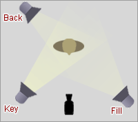 |
| Diagram: The Standard 3-Point Lighting Technique |
Loop Light
This is the setup we used, except we didn't use the hair light.
  |
| Diagram: The 5 Basic Portrait-Lighting Setup |
Butterfly (with bounce)
  |
| Diagram: Butterfly Light Setup 2 |
Silhouette
Setup:
  .jpg) |
| Diagram: Newborn Photo Props |
Workshop: Persona (sketches)
For this persona project, I decided to do self-portraits. This is really out of my comfort zone, but I wanted to do it for that exact reason. I'm used to being behind the camera instead of in front of it, but here are a few that I've started editing so far.


Fall 2013
Workshop: Lighting
Nikon D5200 DSLR
18-70mm
Subscribe to:
Posts (Atom)